
Design and overrides
Design and Manage Label Templates
Create a reusable template for each label size and deliberately roll saved design changes out to physical labels.
Before you begin
Confirm these items before you make changes:
- At least one product has been added to Shelva so you can review realistic previews.
- You know which label size you are designing for.
- Your logo or QR destination is ready if the layout will use it.
Understand the template model
- Templates belong to one label size, and each size can have its own default.
- A product or variant can use a non-default template.
- Available layouts and controls vary by label size.
- Common layouts include Classic, Bold, Monolith, and Grand’s Showroom layout.

Use the size tabs to manage separate templates for Mini, Pocket, Slim, Spotlight, and Grand labels.
Create or edit a template
- Open Design.
- Select the tab for the label size you are designing.
- Choose an existing template or select Create New Template.
- Name the template and choose a layout.
- Configure the design elements supported by that layout.
- Review both regular and sale previews.
- Select Save.
- Optionally select Set as default for that label size.
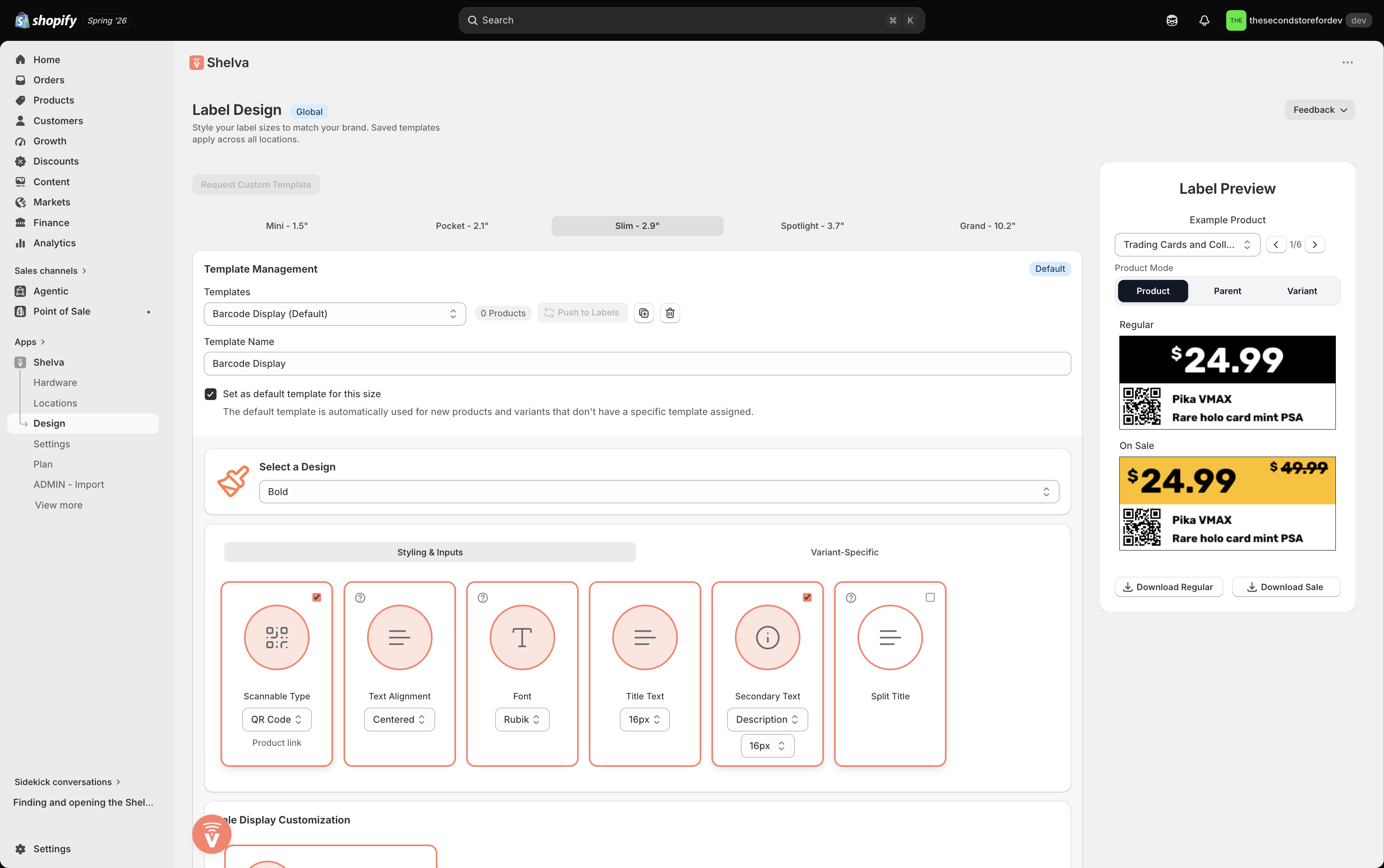
The Label Design page keeps template controls beside regular and sale previews.
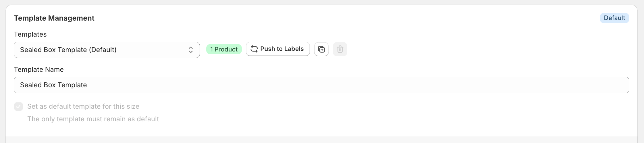
Name the template, set the default, duplicate it, or push it to eligible labels.
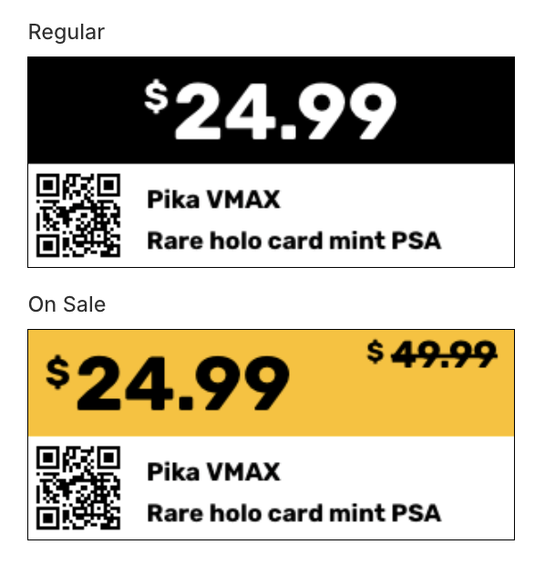
Review both label states before saving the template.
Configure supported design controls
Shelva shows only controls supported by the selected layout. Depending on the layout, those controls can include:
- Font, title sizing, and alignment.
- Accent, sale, and price colors.
- Logo, QR code, or barcode.
- Secondary and tertiary text.
- Vendor, description, stock, SKU, or custom metafield sources.
- Variant title and secondary-text behavior.
- Split cents, sold-out badge, and regular or sale presentation.
Manage the template lifecycle
| Action | Result |
|---|---|
| Save | Stores changes to the reusable template. |
| Set as default | Makes the template the starting design for that label size. |
| Duplicate | Creates a copy you can safely experiment with. |
| Push Design to Labels | Publishes the saved template to eligible published labels currently using it. |
| Delete | Removes the template where deletion is allowed. |
What success looks like
The template appears under the correct size, regular and sale previews are accurate, and any affected physical labels are deliberately updated using Push Design to Labels or a publish action from Configure.